final unity project

the inspiration :

I have been interested into lot of positive body image, every skin-tone is beautiful these types of topic. As I was choosing what to make, I wanted to make an app that was related with this. As I started from every skin-tone is beautiful, it led me to makeup. Making a app that recommends the perfect tone, the perfect product from all types of brands.

from the start page:

Screen Shot 2018-06-23 at 5.16.34 AM.png

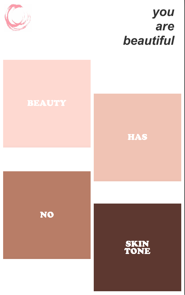
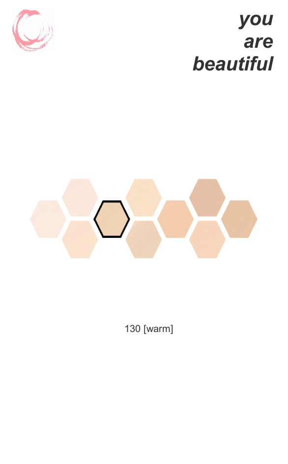
I wanted the start page to send a positive message that there is no difference between skin tones. BEAUTY HAS NO SKIN TONE.

So I divided the colors into 4 sections, and if you click one,

Screen Shot 2018-06-23 at 6.28.55 AM.png


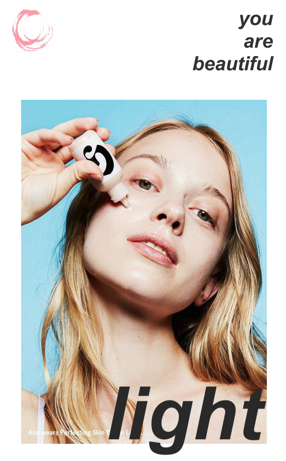
it changes into a photo and I thought of making this app into a community and people can upload selfies and make this scene a place where they can introduce themselves or use this scene as advertisement.

Screen Shot 2018-06-23 at 9.12.47 AM.png

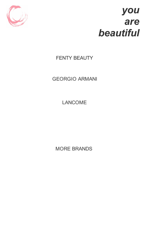
Next, clicking one more time it will show you the brands. You can pick your top3 brands and also see more brands if you want. By clicking the brand it will lead you to the foundations, and if you pick the foundation it will show you shades that are in your skin tone field, and if you click it, it will lead you to the page where you can buy the product as well.

Screen Shot 2018-06-23 at 9.13.00 AM.png


Along, creating this app, I had a very hard time with changing the scenes. Some how the code was not working so it took me a long time to change the scenes. At first the code that I used had more than one in the SWITCH part but I decreased it into one, and then the code worked.

I hope to make this app, and create a new beauty community app.


unity memo 0614

how to put unity into your phone

android phone –

https://developer.android.com/studio/

01 download and install

02 android SDK(software development kit)

jdk – java development kit

ndk – only for specific apps

oracle

users/yourname/library/android/sdk

java – /library/java/javaVirtualMachines/jdk1.8.0_151.jdk/contents/home


Learning the rules of design

The professor introduced a list of rules of design made by a spaceship designer.

3. Design is an iterative process. The necessary number of iteration is one more than the number you have currently done. This is true at any point in time.

8. In nature, the optimum is almost always in the middle somewhere. Distrust assertions that the optimum is at an extreme point.

11. Sometimes, the fastest way to get to the end is to throw everything out and start over.

12. There is never a single right solution. There are always multiple wrong ones, though.

14. (Edison’s Law) “Better is the enemy of “good”.

15. (Shea’s Law) The ability to improve a design occurs primarily at the interfaces. This is also the prime location for screwing it up.

20. A bad design with a good presentation is doomed eventually. A good design with a bad presentation is doomed immediately.

21. (Larrabees’s Law) Half of everything you hear in a classroom is crap. Education is figuring out which half is which.

23. The schedule you develop will seem like a complete work of fiction up until the time your customer fires you for not meeting it.

26. (Montemerio’s Law) Don’t do nuthin’ dumb. When we don’t know what we’re doing, we do stupid things.

27. (Varsi’s Law) Schedules only move in one direction.

34. (Roosevelt’s Law of Task Planning) Do what you can, where you are, with what you have.

35. (de Saint-Exupery’s Law of Design) A designer knows that he has achieved perfection not when there is nothing left to add, but when there is nothing left to take away.

36. Any run-of-the-mill engineer can design something which is elegant. A good engineer designs systems to be efficient. A great engineer designs them to be effective.

38. Capabilities dictate requirements.

40. (McBryan’s Law) You can’t make it better until you make it work.

41. There’s never enough time to do it right, but somehow, there’s always enough time to do it over.


Finalization of SOOKMAP

We had a few difficulties finalizing our map. Everybody’s schedule did not match so we had to do it all in kakao but it worked perfectly!

With the feedbacks we received we wanted to make a screen-based map. We first wanted to make it a touch screen and actually get the touches work with the map, but it was impossible to work with such a limited time. So instead of handing in a work incomplete, we decided to use raspberry pie with a touch screen and connect it, and put the map on the screen. So we needed to design the map on the computer and create and image, then put it on the screen.

So none of us were design majors so we didn’t know how to create an image or draw one. So we used the powerpoint and we created the map image by adding figures to make it look exactly like the buildings. We added where the cafeteria, cafe, printing room, computer room, shower room, gym is and decided not to add where the restroom is because it is on every floor and we thought it would make the map hard to look. We also added english names of each buildings since the target for this map includes international students. We also added shortcuts, and certain paths to get into the building distinguishing it with colors.

As we worked on this map, we thought it would be great if we could develop one for the people who are blind, adding raised letters. Also, it would have been great if we had a little bit more time and made the touch screen work, so maybe if we touch a certain building, information about that building pops up and if we touch the start building to the destination building it can show the path. KakaoTalk_20180426_040926887.pngKakaoTalk_20180426_040856747.pngKakaoTalk_20180426_040846136.pngKakaoTalk_20180426_024517236.pngKakaoTalk_20180426_024413653.jpg

how we created it

KakaoTalk_20180425_231720099.pngKakaoTalk_20180425_231720640.pngKakaoTalk_20180425_231721045.png

our presentation


CONCLUDING THIS PROJECT

This project was something I have never done in my student life. I first of all wanted to attend this class because I really wanted to learn design and though this was perfect. And doing this design project for the mid-term really taught me lot. First of all, trying to find inspiration from daily life really made me concentrate more on small things in life. Also, picking a topic and actually making it come true with help from others and with teammates really made everything worth it. Creating this really taught me lot about how hard it is to create a map, and that there are so many things to consider into creating anything.

Thank you to all of my teammates, and thank you Professor Todd.

Feedback on the SOOKMAP #1

April 12th Thursday 

After presenting our SOOKMAP we got LOT of feedbacks. From the beginning our main target for this map was for new students (freshman) and international students.

The feedback we received were

  1. Since it is in 2D, we get a better idea on which path to go to so it is better than 3D.
  2. It would be better if the map showed the path in the parking lot.
  3. Arrow symbol of the door looks much better.
  4. Include Saebit Hall.
  5. Include the international students dormitory.
  6. You can go from College of Art to the Korean Food Institute.
  7. Add stairs, landmarks, indicators, disabilities, cafeteria, restrooms, smoking place.
  8. When the building closes.
  9. Keep updating the map and let us know where the construction is.
  10. Where the printing room, computer room.
  11. Layer papers on each floors.
  12. Change the color into a more vibrant color
  13. Curve can be better to find the way